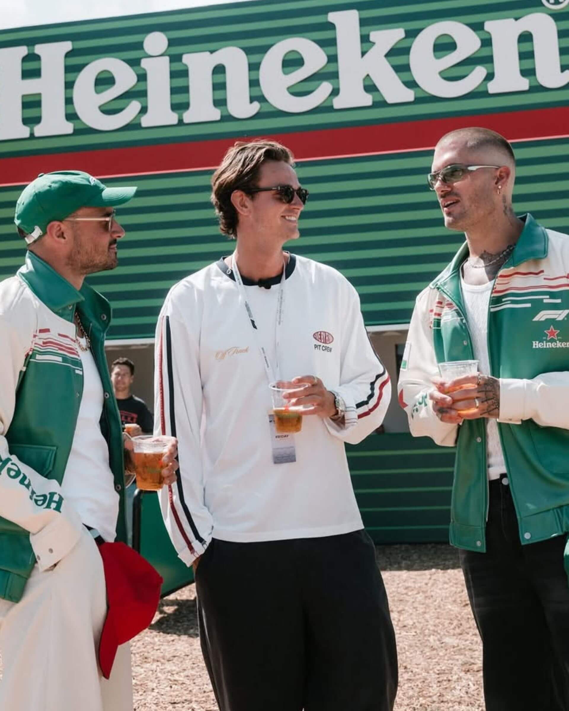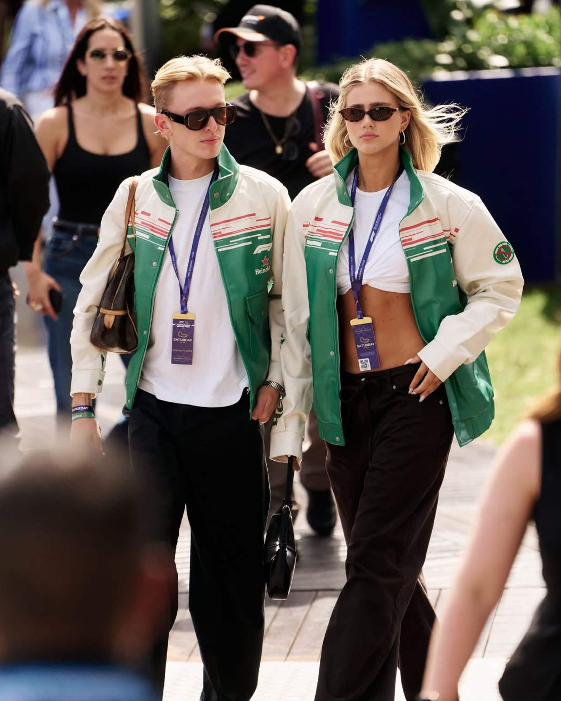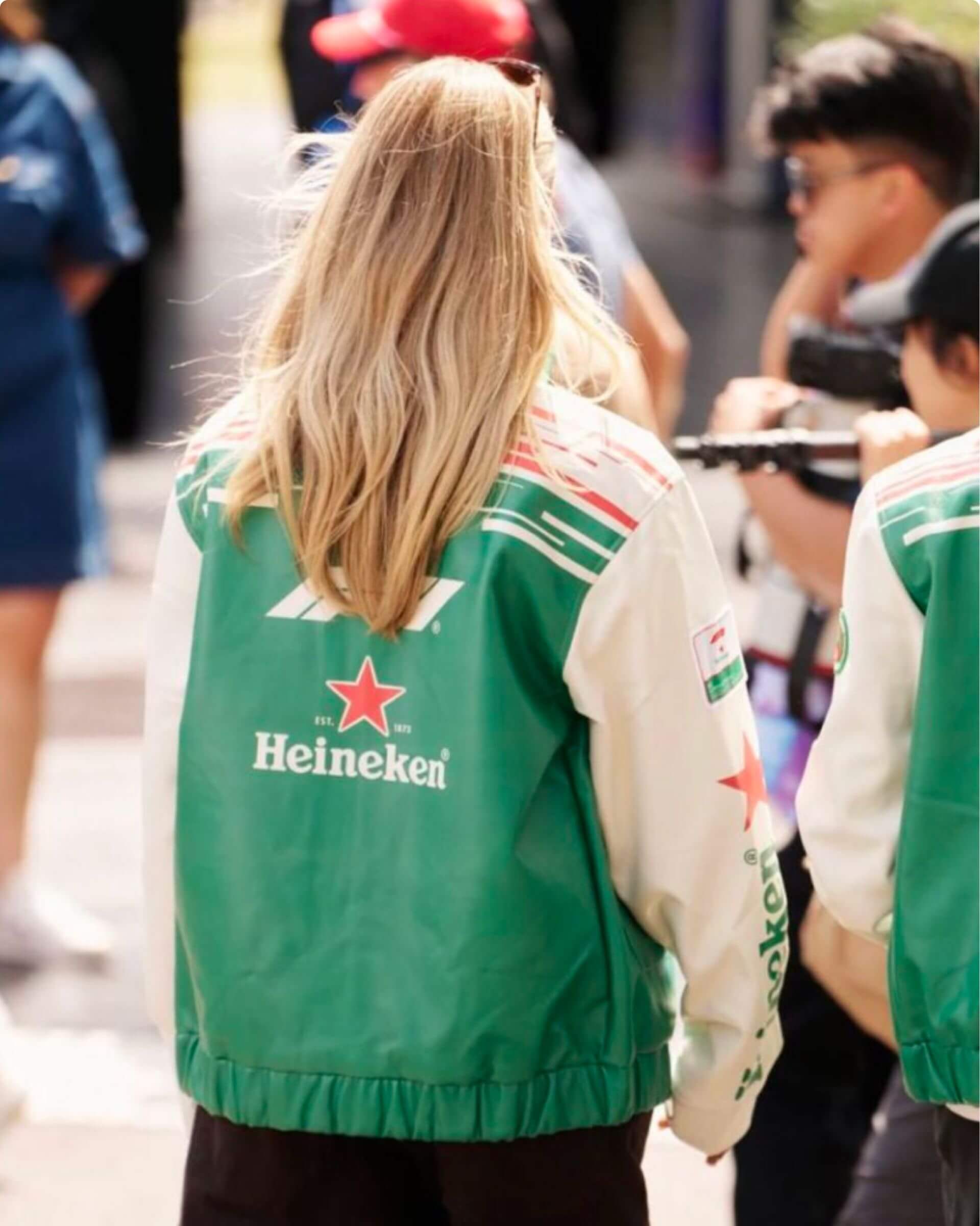
Heineken asked us to activate its global partnership with Formula 1 through merchandise. The catch: a race calendar spans continents, cultures and climates. Whatever we designed had to work in Melbourne, Monaco and Mexico City alike, in one recognisable Heineken voice. So the real question wasn't what a single piece should look like. It was what system could carry them all.
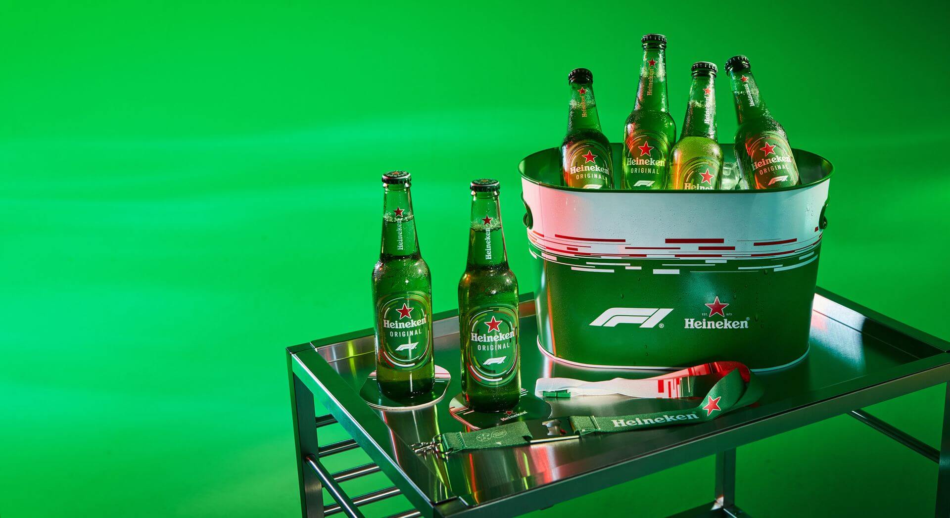
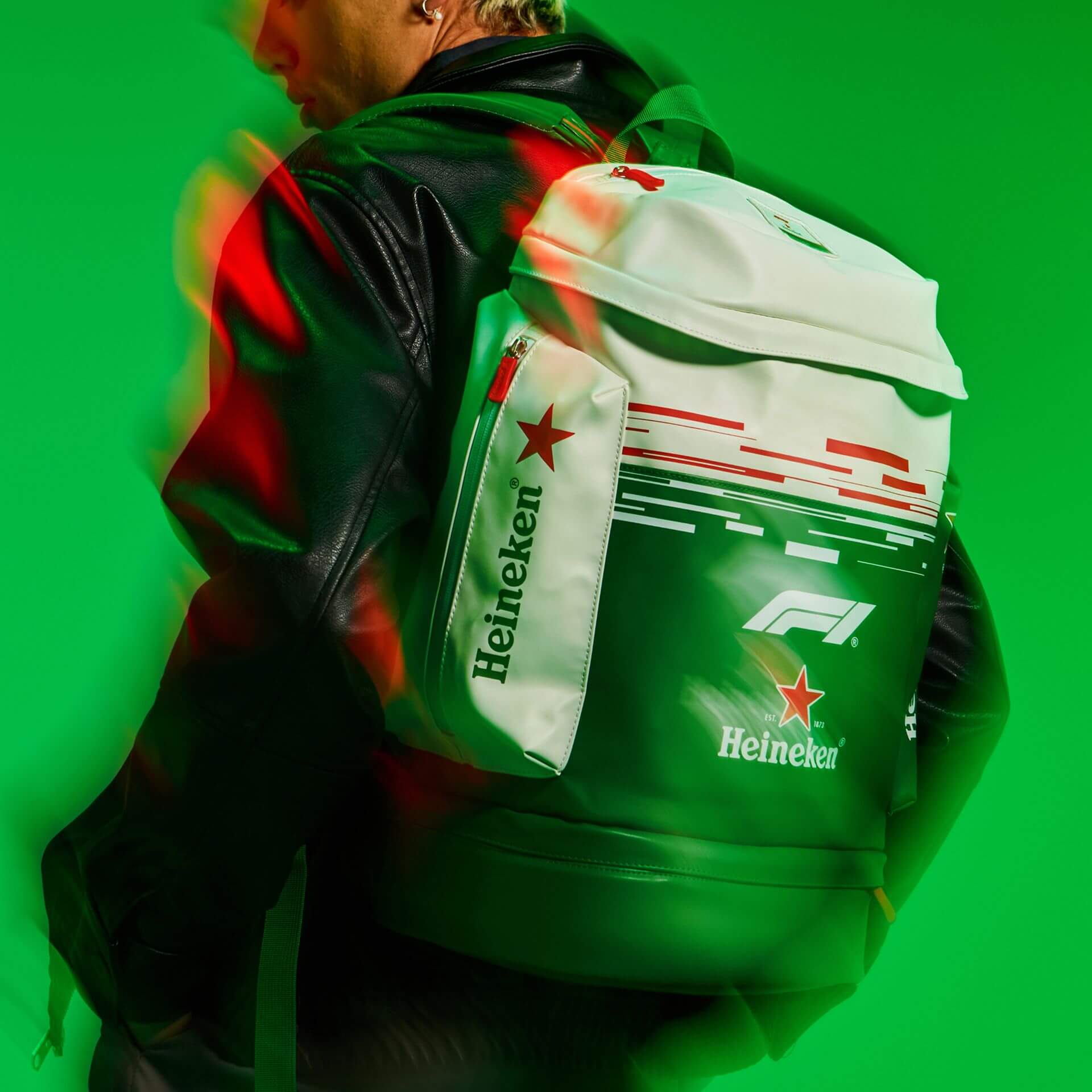
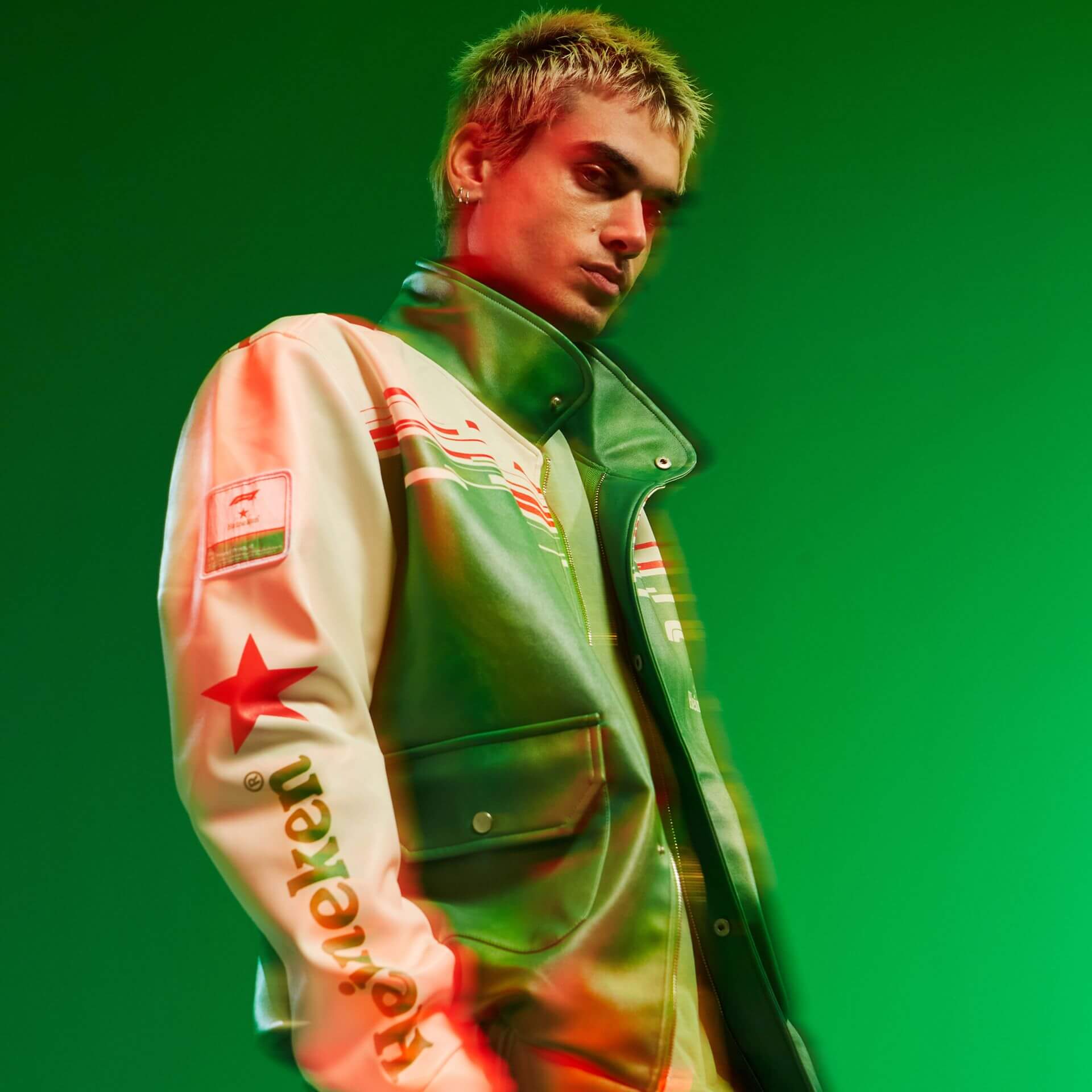
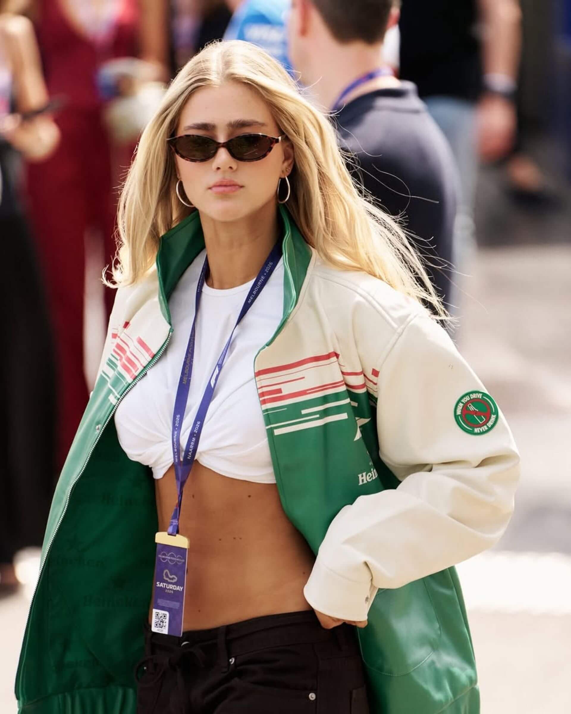
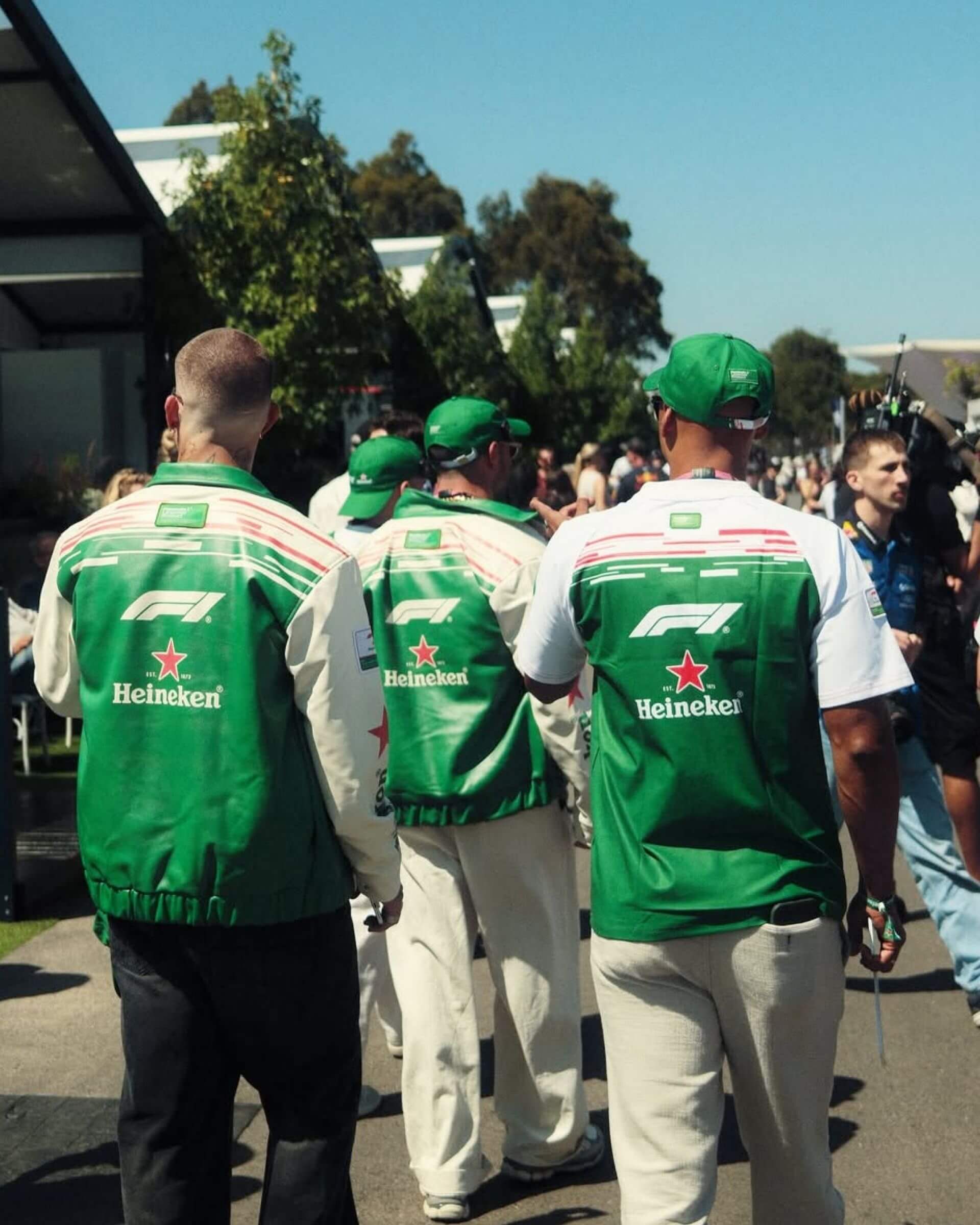
We translated the energy of the sport into a design system: a set of rules, shapes and cues that lets every piece feel unmistakably F1 and unmistakably Heineken, wherever it lands. Speed, precision and the graphic language of the track, built to flex across products and markets.
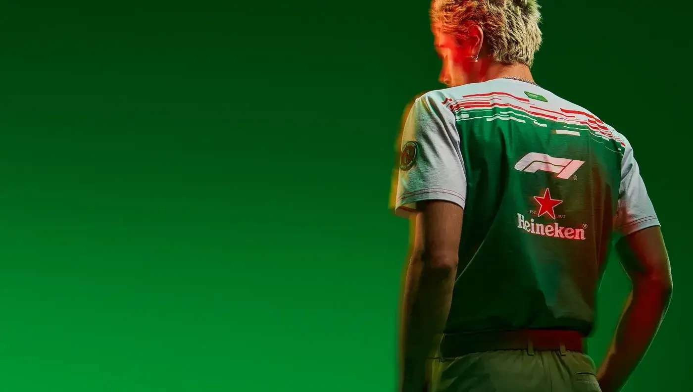
Design alone doesn't sell a collection. We delved deep into the racing community and thought about how to translate the movement into the merchandise presentation. No static product shots, but speed captured in a still. Movement, creative camera work and rich, dynamic lighting brought the track into the frame, with sharp detail and tactile compositions helping highlight the quality and craftsmanship of the range.
The range became one of Heineken's best-selling merchandise collections to date. The designs were picked up by influencers and fans alike, generating organic traction on social and carrying the collaboration far beyond the track. The photography became a key launch asset, helping to communicate the premium feel of the merchandise and to drive quality cues across the entire collection.