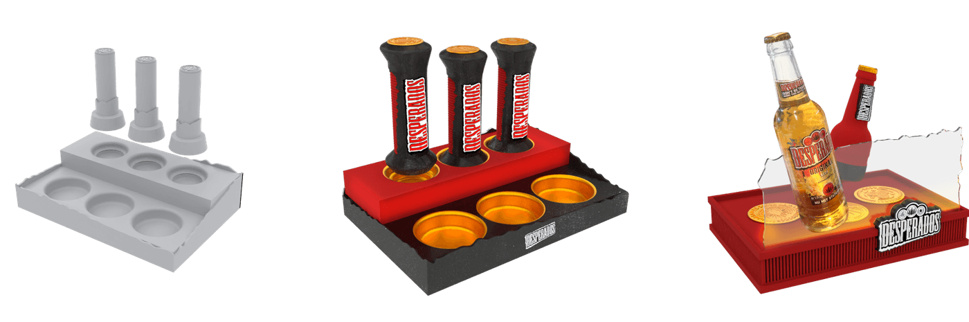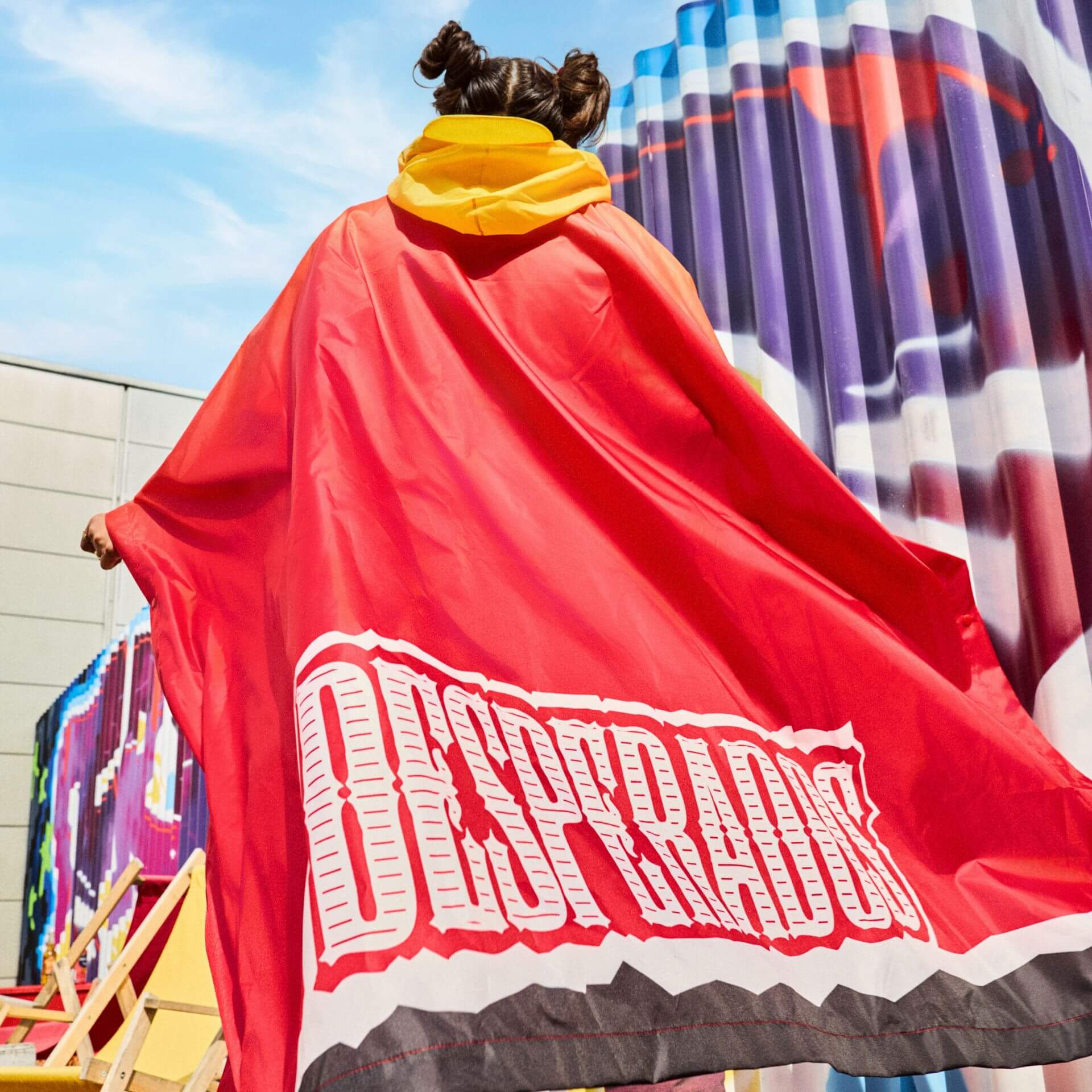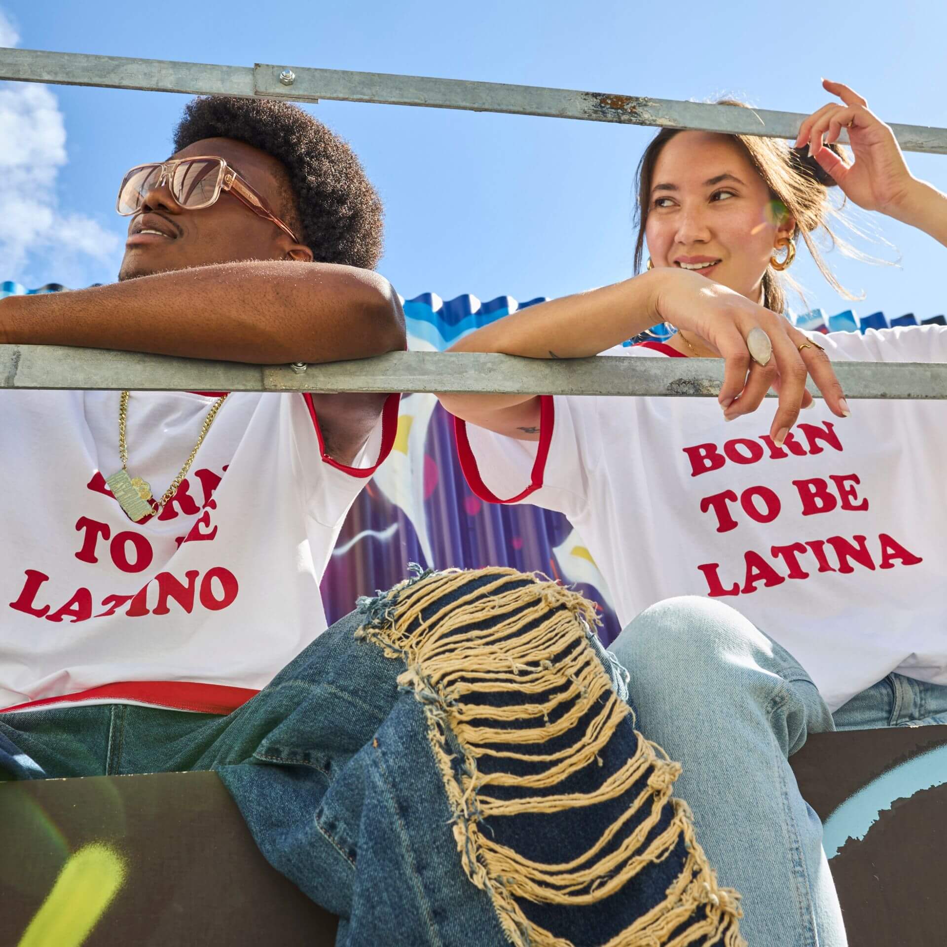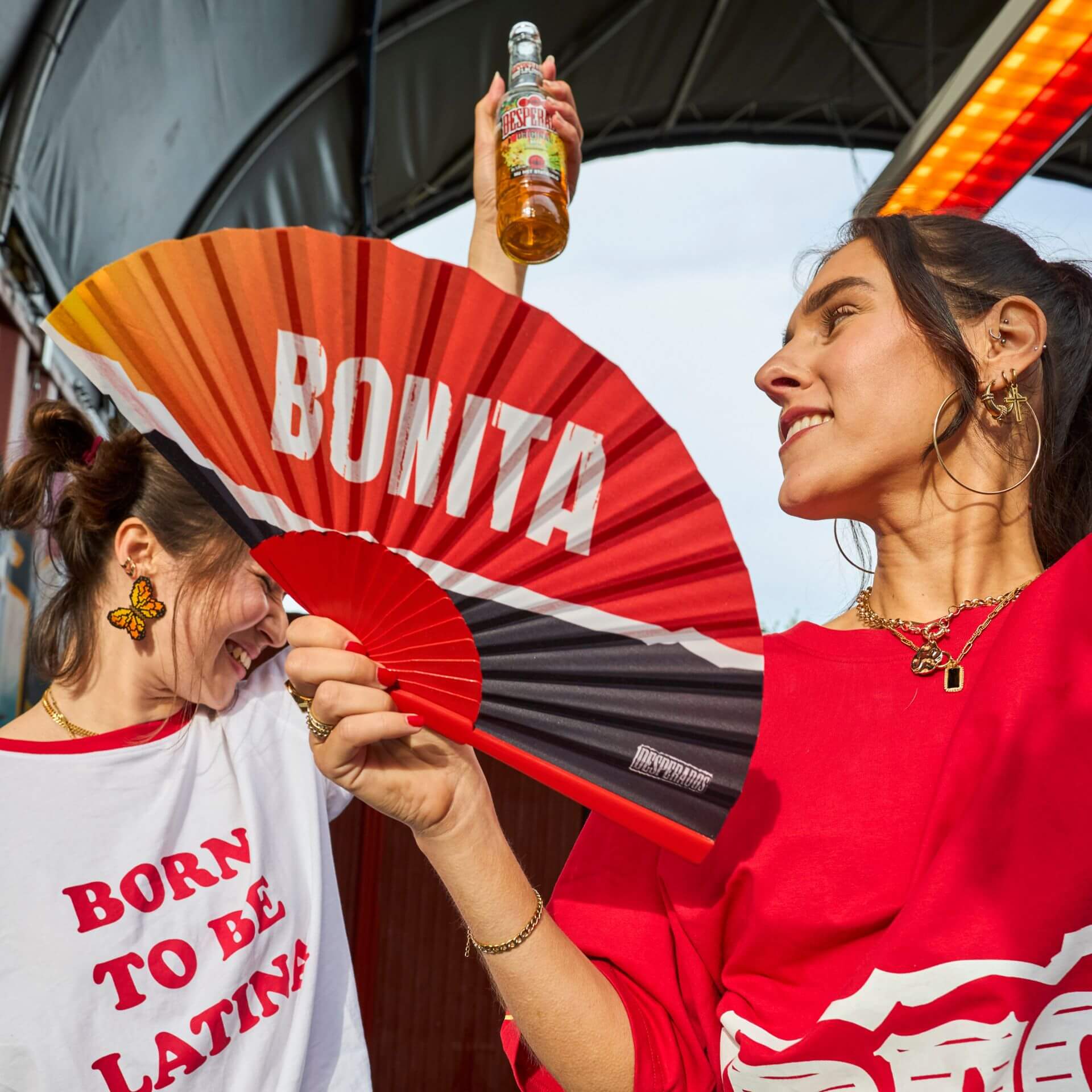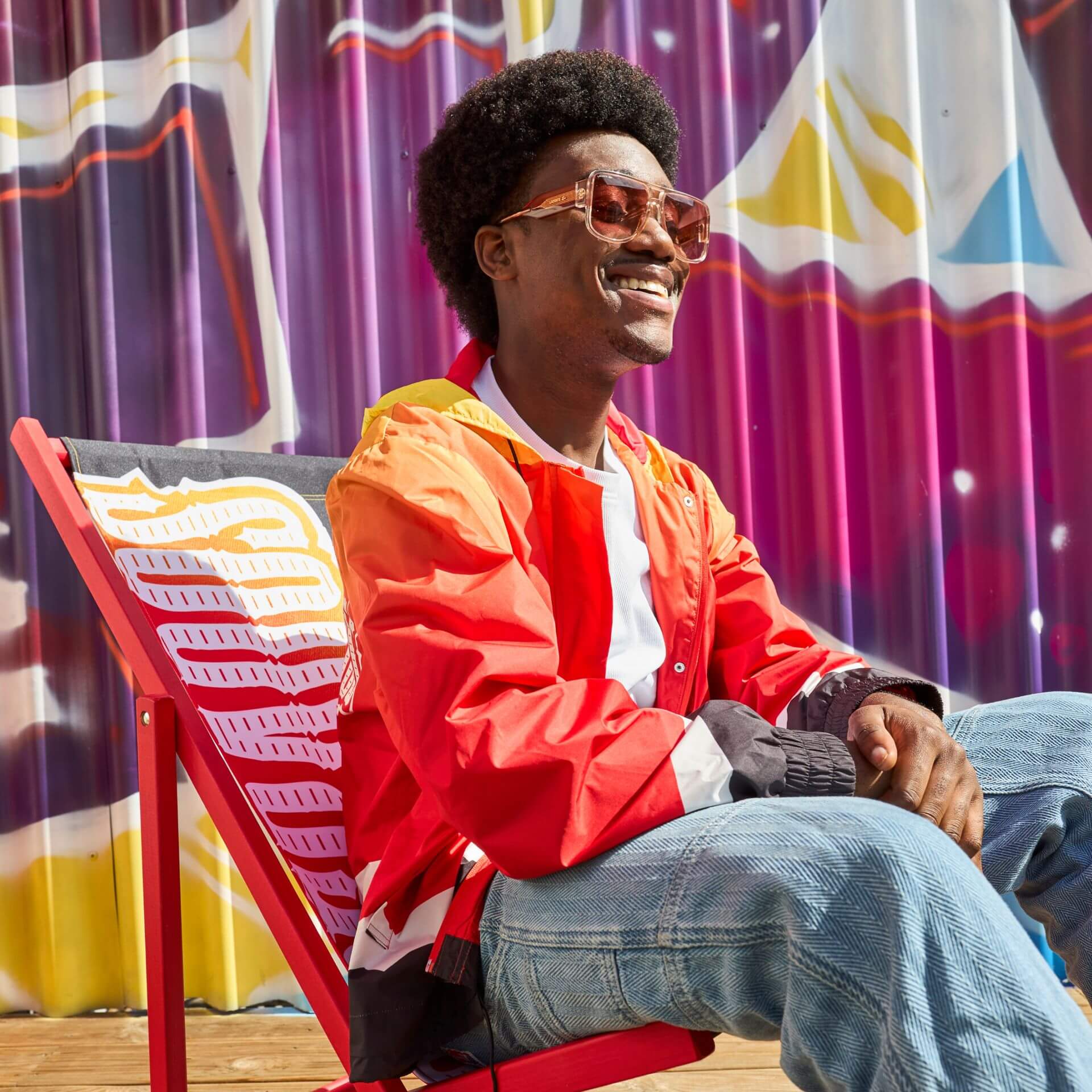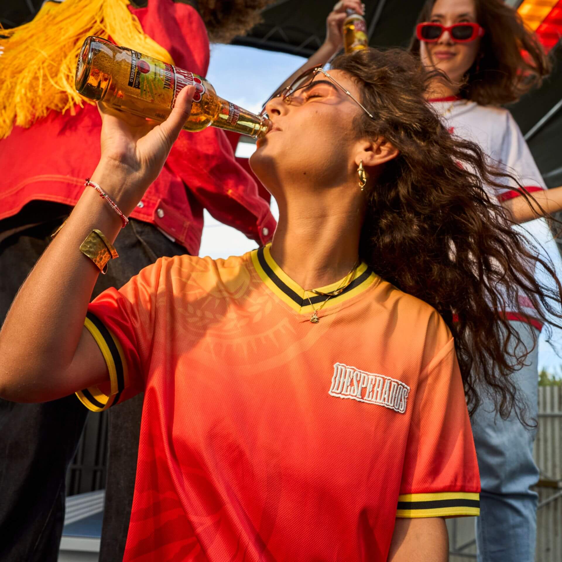
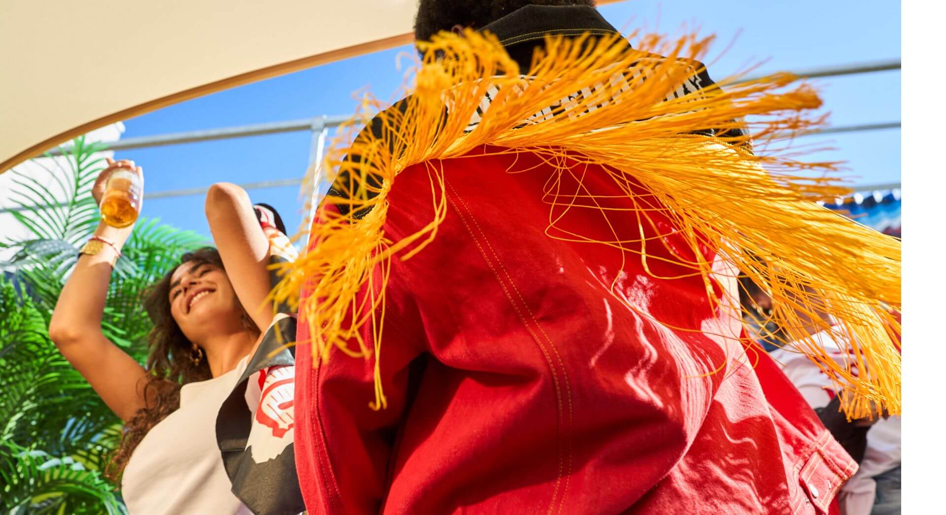
Desperados repositioned itself as The Beer with Latin Vibe: passion, heat, ritmo, and the simple truth that you can't sit still. More than a beer, it's a mindset, rooted deep in the brand's DNA. That mindset needed to become something you can hold, wear, and even hang on a wall: a range of merchandise and premiums that brings the positioning to life. The catch: translating an existing brand identity is usually straightforward, but nothing here was off the shelf. Every item was custom, and every item had to move.
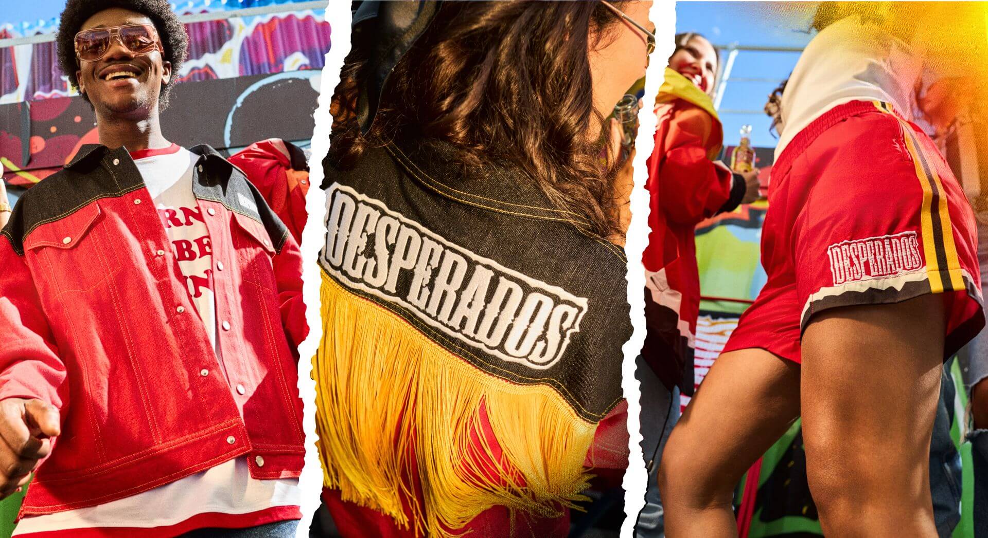
We started with strategy before style: touchpoint analyses to map where the brand meets its crowd, and strategic item indexing to decide which items carry the right energy at each of those moments. From there, together with the Heineken design team, we translated the Desperados identity into a range built for hot Latin nights: from festival cups and promoter shirts for events to denim jackets, bucket hats, neon signs, and even a blower, because a little cooling never hurts in an atmosphere this sultry.
Because every item was custom, every item earned the full journey: from first sketch to 3D render to the final product in hand. Desperados Red, Latin Yellow and Fruity Orange run through it all, while materials, fit and accessories carry the dynamism of the positioning: merch that makes you move. Then we captured it the way it lives. No sterile product shots, but real-life photography that supports the merchandise catalogue and gives every market the feeling behind the items, not just the items themselves.
A collection that lets the whole world groove along, backed by a catalogue that sells the energy as much as the products. To send out the vibes, we created the mailings that bring the range straight to the markets. A true collaborative effort with the Heineken team, and a case where disciplines met just as naturally as the items met the dance floor.
The Desperados range greets you the only way it knows how: vibe to meet you.